From Friction to Flow
We redesigned Workbounce’s onboarding to remove friction, making it easier for users to connect integrations, structure their data, and start seeing value immediately.
By simplifying setup, improving guidance, and introducing AI-powered topic recommendations, we created a smoother, more intuitive experience. These changes led to faster adoption, fewer setup issues, and stronger early engagement.
A Frictionless First Experience
As part of Incomparable, leading the design and creative direction for Workbounce's onboarding overhaul, our goal was to create an experience that allowed users to seamlessly integrate their existing tools and immediately see value in the platform. Workbounce thrives on its ability to unify customer data and surface actionable insights, but a slow or cumbersome setup process risked losing user engagement before they even got started.
Through user interviews and product analytics, we identified three major pain points in the original onboarding flow:
- Users struggled to connect third-party integrations due to unclear steps and authentication issues.
- The onboarding process lacked guidance on how to structure their data effectively.
- New users often landed on an empty dashboard with no clear next steps, leading to drop-offs.
To address these issues, we designed a streamlined onboarding flow that emphasized clarity, speed, and immediate value. Our approach focused on breaking down each step into digestible actions, ensuring users felt guided rather than overwhelmed. We also introduced progressive disclosure, surfacing only the most relevant information at each step to prevent cognitive overload.
Connect with Ease
Workbounce's power comes from its ability to aggregate data from various sources like CRMs, email platforms, and knowledge bases. However, our initial integration setup lacked transparency, leaving users unsure if they had successfully connected their tools.
To solve this, we:
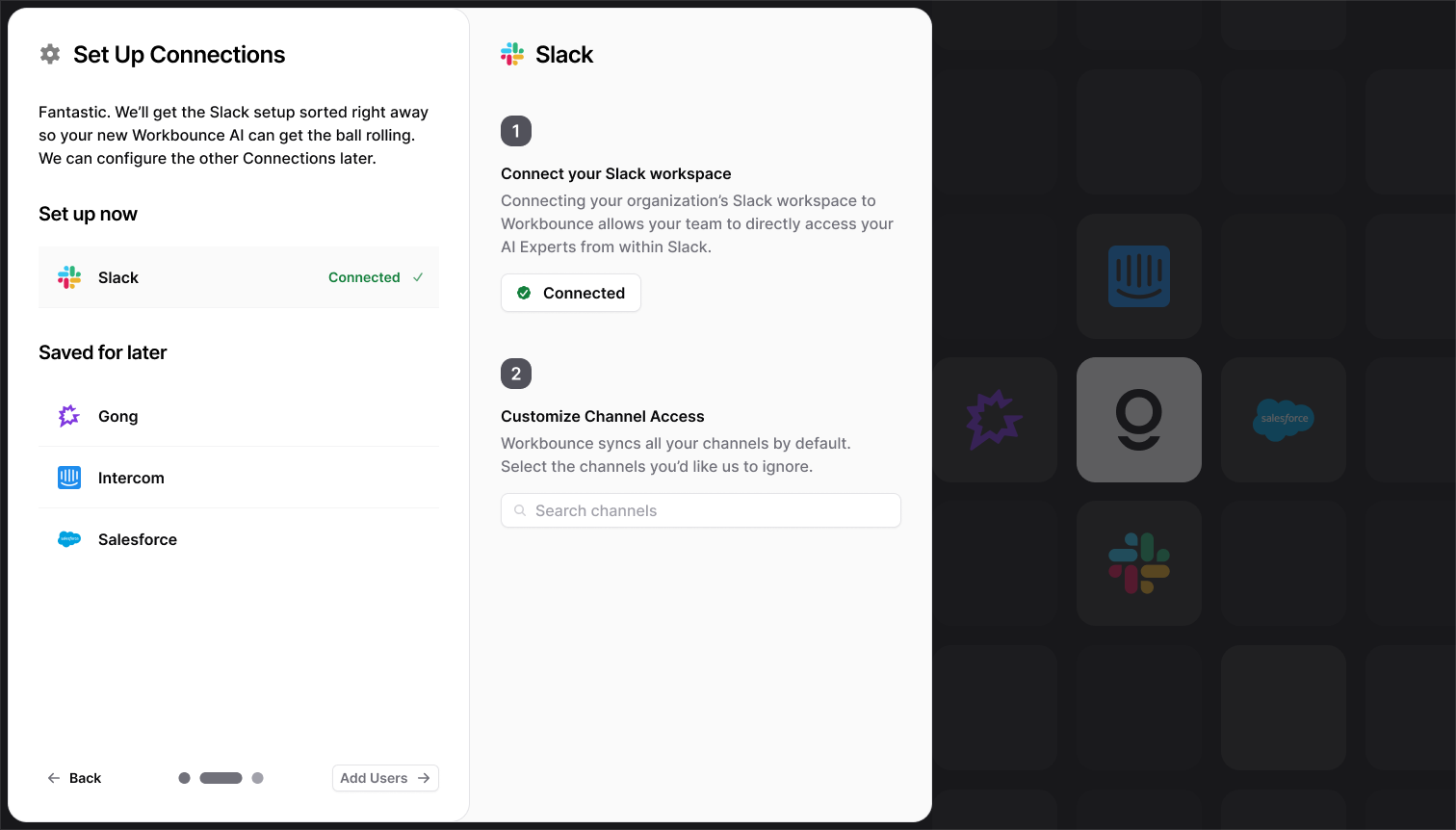
- Redesigned the integrations onboarding with clear status indicators and step-by-step connection instructions.
- Introduced inline error handling, ensuring users could resolve authentication issues without frustration.
- Implemented a one-click OAuth process for key integrations, dramatically reducing setup time.
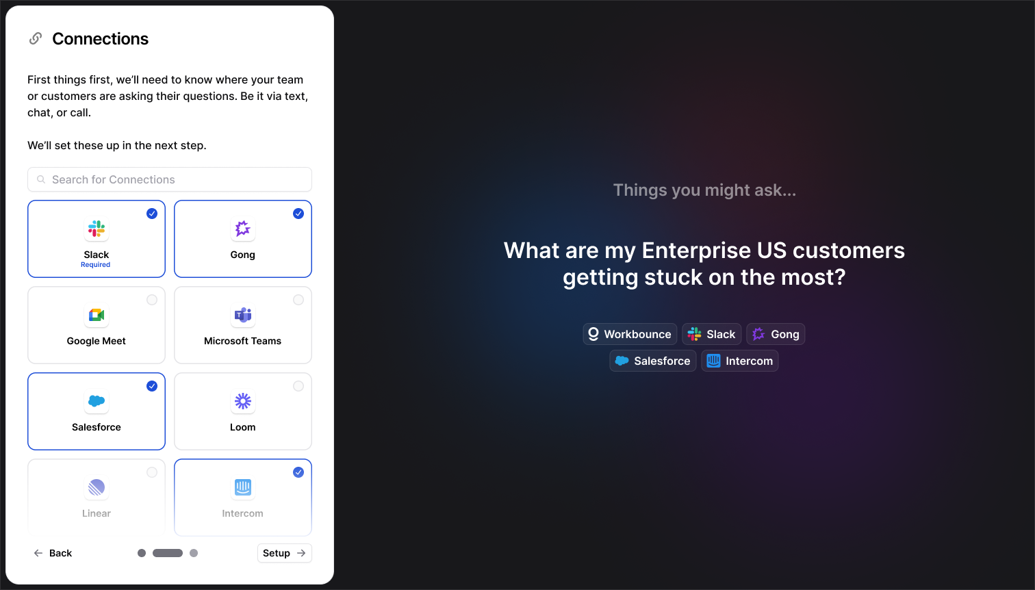
The placeholder content for Connections shows potential questions the user can ask, and changes based on the combination of Connections selected
Users can easily set up and fine-tune their Connections with losing context of the overall onboarding—and are not forced to go through all of it at once
Beyond just redesigning the interface, we also improved the backend processes that handled API authentication, reducing failures due to misconfigured credentials. We worked closely with Workbounce's engineers to introduce real-time validation, allowing users to see the success or failure of a connection instantly rather than encountering issues later.
This proactive approach not only made integration setup smoother but also reduced the number of support tickets related to connectivity issues.
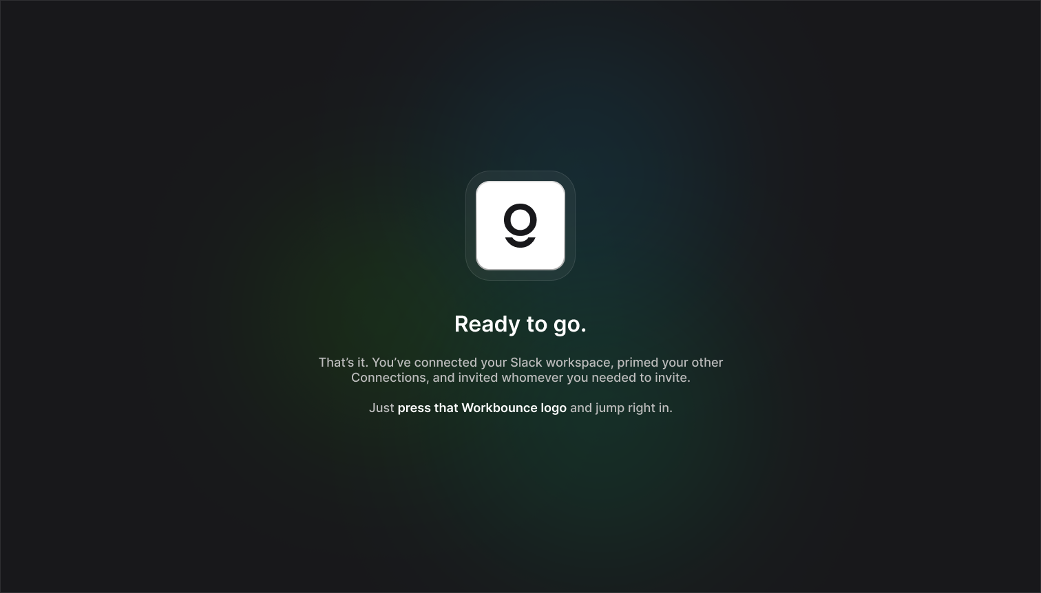
Once set up, the users are greeted by a Playstation-esque splash screen to make that first experience as memorable as possible
Kickstarting Topics
Once users connected their data sources, we faced a new challenge: what next? Originally, users had to manually configure data topics—essentially categories that organize their insights—but many were unsure where to start, leading to a stalled experience.
To guide users, we introduced:
- Pre-configured topic templates based on their industry and integrations.
- AI-powered suggestions that analyzed imported data and recommended relevant topics automatically.
- A guided walkthrough that prompted users to customize their first topic step-by-step.
In addition to these improvements, we added contextual help within the topic creation interface. A simple tooltip system provided just-in-time guidance, explaining what each field represented and how it contributed to Workbounce's data structuring.
We also built in real-time preview functionality, allowing users to see how their topics would populate with live data before committing to changes. This reduced friction significantly and gave users immediate confidence in their setup. Furthermore, we enabled bulk topic creation, allowing teams to set up multiple data streams in one go, accelerating adoption for larger organizations.
Easy access to templates that formulated based on connected data makes the Topic setup exponentially more efficient
Measuring Success
The improvements we made to onboarding, integration setup, and topic creation had a measurable impact on user adoption.
By prioritizing clarity, automation, and ease of use, we transformed Workbounce's onboarding into a frictionless experience that set users up for success from day one. As the Design & Creative Director, I focused on ensuring that every step—connecting integrations, structuring data, and surfacing insights—felt effortless, ultimately driving stronger user adoption and long-term engagement.
Increase in Onboarding Completion Rate
More users completing full setup
Reduction in Churn During Setup
Fewer drop-offs during integration
Reduction in Time-to-First-Insight
Faster path to seeing value
Improvement in First-Week Retention
Stronger early engagement